Onni
Resistenza Type · Giuseppe Salerno, Paco González · 2026
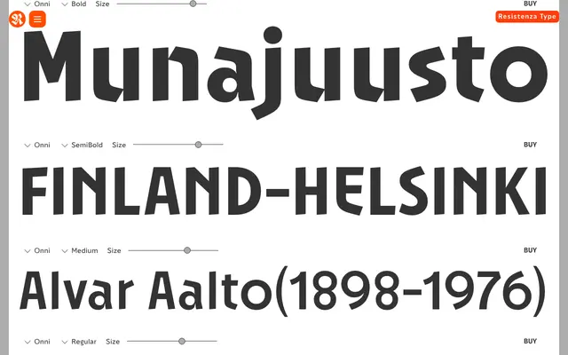
A ten-weight geometric sans-serif from Resistenza with Swiss modernist bones and deliberate imperfections – unsteady baseline, angled characters, a triangular aperture on the "e" – aimed squarely at display and branding work.
About
Onni is a geometric sans-serif by Giuseppe Salerno and Paco González, debuted by Resistenza in early 2026. It builds on a grid of perfect circles and rectangles but then subverts it: characters tilt slightly along an inconsistent baseline, the lowercase "e" carries a triangular cutout, and the "R" sweeps past conventional geometry. Ten weights from Hairline to Black, with a variable font option, make it versatile in scale, though the quirky detailing keeps it best suited to headlines, packaging and identity work rather than running text.
Classification
Contemporary geometric sans-serif with deliberate eccentricities: characters sit at slightly varying angles along an inconsistent baseline (described as "kinetic alignment"), lowercase "e" has a triangular cutout aperture, and the "R" tail curves beyond conventional geometric construction. Upright only; no italic. 10 weights plus variable font axis. Display-leaning despite the broad weight range.