Oddity Script
Resistenza Type · Giuseppe Salerno, Paco González · 2023
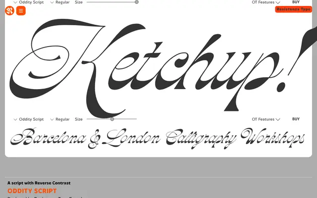
A single-weight calligraphic script with inverted stroke contrast and a strong 1970s nostalgia character, suited to display use in posters, branding and packaging.
About
Oddity Script takes the skeleton of English calligraphy and flips its contrast: strokes that would conventionally be thick are drawn thin, and vice versa. The effect is distinctive but narrow in application, best at large sizes where its 70s period personality can read clearly. OpenType features add swash capitals and alternate glyphs, giving some flexibility within the single weight.
Classification
Single-weight calligraphic script with deliberately inverted stroke contrast – thin where you'd expect thick, thick where you'd expect thin. Inspired by the skeletal structure of Nautica with contrast reversed. Selective exceptions in certain letterforms preserve rhythm and legibility. Heavy 1970s period character.