Nautica
Resistenza Type · Giuseppe Salerno, Paco González · 2014
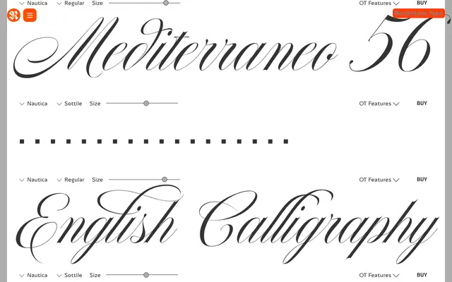
A high-contrast Copperplate-inspired script by Giuseppe Salerno and Paco González, spanning three weights with over 1,000 glyphs and extensive OpenType decoration.
About
Nautica draws on the Copperplate ductus to produce a narrow, pointed-nib script with strong contrast and assertive personality. It ships in Regular, Medium and Bold, plus a supplementary Icons and Knots set, and packs in ligatures, swashes and contextual alternates across more than 1,000 glyphs. Language support extends to 200+ scripts, though its use cases are firmly in formal branding, packaging and editorial contexts that call for calligraphic flair.
Classification
High-contrast pointed-nib script inspired by Copperplate's ductus. Decorative caps; ligatures and swashes drawn from brush pen aesthetics. The slant is intrinsic to the script design — there is no separate italic.