Merendina
Resistenza Type · Giuseppe Salerno, Paco González · 2017
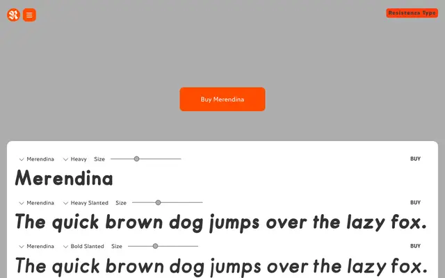
A cheerful geometric display family with a hand-drawn quality, spanning six weights with matching slanted companions and OpenType swashes and alternates.
About
Merendina pairs a geometric skeleton with an informal, hand-drawn quality that gives it warmth without sacrificing structure. The 12-style family runs from Thin to Heavy, each weight accompanied by a slanted variant, and includes OpenType alternates and swashes for additional expressive range. It fits food branding, packaging, children's publishing and casual editorial work where a friendly, approachable tone is needed.
Classification
Geometric letterform construction with an informal, hand-drawn touch; slanted variants rather than true italics; sometimes marketed as a kids/food display font; related to casual informal sans-serif traditions (cf. Futuramano, FF Providence Sans, North Bergen).