La Bodeguita
Resistenza Type · Giuseppe Salerno and Paco González · 2018
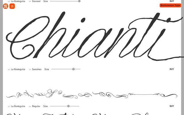
A Spencerian pointed-nib script drawn with walnut ink, built for wine labels, food packaging and luxury brand work where handcrafted provenance is the point.
About
La Bodeguita is a calligraphic script drawn by Giuseppe Salerno and Paco González using a Spencerian feather on an oblique penholder and walnut ink, producing soft, flowing letterforms with genuine pen character. The family ships as three styles – Regular, Slanted and Swashes – with over 400 glyphs, giving designers room to build varied lettering compositions. Its name nods to the bodega, and its natural home is wine and spirits labels, fine food packaging and anywhere a brand leans on craft and origin.
Classification
Spencerian-influenced pointed-nib script drawn with walnut ink on an oblique penholder. Three styles rather than a conventional weight range: Regular, Slanted (an oblique variant, not a true italic), and Swashes (decorative alternate glyphs). No width variants, no optical sizes, no condensed cuts.