Flipante
Resistenza Type · Giuseppe Salerno, Paco González · 2023
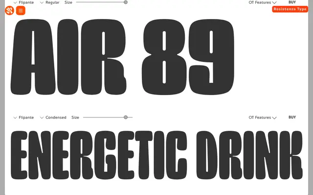
A geometric display sans spanning ultra condensed to expanded across five widths, defined by tubular letterforms, prominent ink traps and rounded curves, with oblique companions and a variable font option.
About
Flipante, designed by Giuseppe Salerno and Paco González for Resistenza Type, is a display sans-serif whose tubular construction, decorative ink traps and expressive curves give it a personality well beyond a neutral grotesque. The family covers five widths from ultra condensed to expanded, each paired with a slanted companion, and the entire range is also available as a variable font on the width axis. It is aimed squarely at branding, packaging and headline work in print and digital contexts.
Classification
Geometric display sans-serif built on a pronounced width axis, running from ultra condensed to expanded. The construction uses tubular letterforms with decorative ink traps and rounded curves rather than a neutral grotesque skeleton. No true italic – each of the five widths is paired with an oblique (slanted) companion only. Also released as a variable font on the width axis.