Auster Slab
Resistenza Type · Giuseppe Salerno, Paco González · 2019
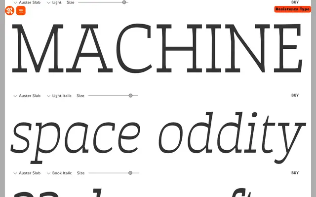
A reversed-contrast slab companion to Resistenza's Auster sans, spanning ten weights with matching italics and a hand-drawn character suited to editorial, branding and display work.
About
Auster Slab carries the inverted stroke stress of Resistenza's Auster sans into a slab serif form, where thick horizontals against thinner verticals give the family a distinctive character without tipping into novelty. The ten-weight range from Thin to Heavy – each paired with a matching italic, 20 styles total – gives it genuine breadth across display and text settings. Designed by Giuseppe Salerno and Paco González, the letterforms were first laid down with a flat brush, refined in pencil on tracing paper, then carefully digitised with full OpenType feature support.
Classification
Slab serif with inverted (antique/Italian) stress – horizontal strokes are thicker than verticals, opposite to conventional serif construction. Forms were developed by hand with a flat brush before pencil refinement and digitisation. Companion to the Auster reversed-contrast sans, the slab version shares the same stroke logic but adds squared serifs that reinforce its period character. Ten upright weights from Thin to Heavy, each with a matching italic, giving the family genuine typographic range.