Auster
Resistenza Type · Giuseppe Salerno, Paco González · 2019
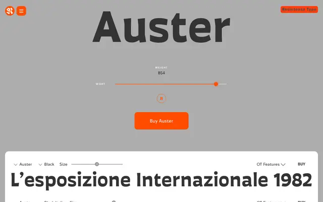
A 20-style reverse-contrast sans-serif with genuine craft behind it, born from hand-painted letterforms at the TipoBrda workshop in Slovenia and refined over three years by Resistenza's two founders.
About
Auster inverts the standard stroke logic of a sans-serif – horizontal strokes are thicker than the verticals – giving it a confident, slightly idiosyncratic character without tipping into novelty. Giuseppe Salerno and Paco González spent three years on it, starting with a flat brush, moving to pencil on tracing paper, then to careful digitisation, and the handmade origin shows in how the curves sit. The 10-weight range with full italics and a variable version makes it adaptable, though the reverse contrast means it reads best at headline or medium-display sizes rather than long body copy.
Classification
Reverse contrast humanist sans-serif: horizontal strokes are deliberately heavier than the verticals, inverting the normal stress convention. The forms originated as hand-painted letterforms using a flat brush, then refined on tracing paper before digitisation. The result sits somewhere between a sturdy text sans and a personality-led display face.