Apero Slab
Resistenza Type · Giuseppe Salerno, Paco González · 2016
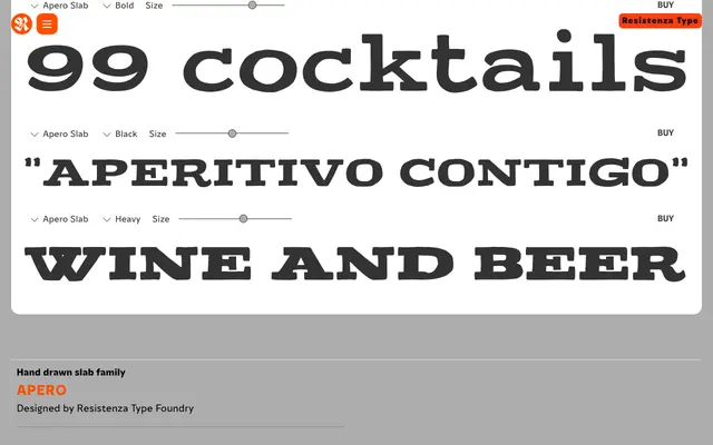
A hand-lettered slab serif in five weights inspired by Turin's aperitivo tradition, with two decorative inline effects.
About
Apero Slab is a cheerful hand-drawn slab serif designed by Giuseppe Salerno and Paco González, released in 2016. It spans five weights from Regular to Heavy, with two additional Lines cuts adding a decorative inline effect to the Bold and Heavy styles. The organic letterforms suit lifestyle branding, menu design and display headlines, though the handwritten character limits its range beyond those contexts.
Classification
Hand-drawn slab serif with organic, informal letterforms across five weights (Regular to Heavy), plus two decorative inline/lines effect cuts. No italics. Part of the broader Apero superfamily, which includes an accompanying sans-serif companion. Release date August 2016.