Annuario
Resistenza Type · Giuseppe Salerno
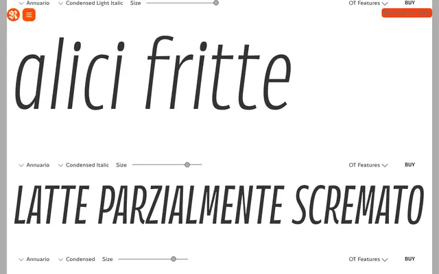
A humanist sans with brush-influenced strokes, originally drawn for calendar layouts, spanning three widths and six weights with full italics and a variable version.
About
Annuario started life as a typeface for calendar design and expanded into a 48-style family covering Condensed, Regular and Expanded widths across six weights from Thin to Black, each with matching italics. The letterforms carry a subtle brushy quality that gives display settings warmth without tipping into ornament. A variable version covering both weight and width axes suits editorial systems that need typographic range across breakpoints or animated headlines.
Classification
Sans serif with brush-influenced strokes and a humanist construction. Multi-width family spanning Condensed, Regular and Expanded cuts across six weights; the brushy texture gives headlines warmth. Originally designed for calendar layout. A companion Variable version covers both weight and width axes.