 MegaMegaTypeType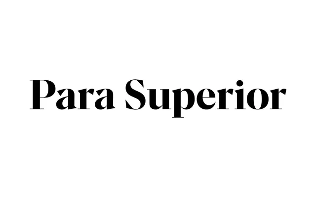
Para Superior is Rellence's display-grade optical cut of the Para family, a contemporary sans drawing from Didone and Transitional sources, with seven weights, matching italics and a variable weight axis.
About
Para Superior sits at the top of the three-cut Para system alongside Central and Grand, each offering seven weights with matching italics. It draws from Didone and Transitional traditions to arrive at a contemporary, curve-forward sans suited to editorial headlines, logotypes and packaging. A variable weight-axis version (Para Superior Flex) and 673 glyphs per style with 43+ language support complete the offering.
Classification
Contemporary sans drawing from Didone and Transitional type traditions. The Superior cut is the display-grade optical size of the Para family, alongside Grand and Central. Rellence specifies a contrast index of 3.4 and a 1.2 spacing ratio. Described by the foundry as "curved, modern, feminine — like Gill Sans with makeup."