 MegaMegaTypeType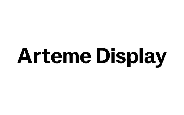
The high-contrast counterpart to Arteme Sans, this five-weight neo-grotesque display carries tight spacing and refined kerning built for headline work.
About
Part of Rellence's Arteme family, the Display variant heightens contrast and tightens spacing relative to its Sans sibling while sharing the same geometric-rationalist structure and slightly angled cuts. Five weights run from Regular to Black, each with a matching italic, giving 10 static styles in total alongside a variable Flex version with Weight and Slant axes. With 524 glyphs and coverage across 43 languages, it suits branding and editorial work at display scale.
Classification
Neo-grotesque display typeface and the high-contrast counterpart to Arteme Sans. Shares the family's geometric-rationalist structure and slightly angled cuts, but with elevated contrast and refined spacing optimised for headline scale. Includes a variable font version (Arteme Display Flex) with Weight and Slant axes.