 MegaMegaTypeType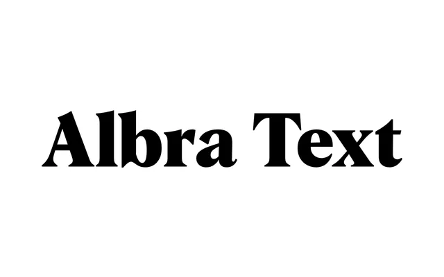
A low-contrast text serif from Jan Weidemüller, optimised for extended reading at smaller sizes as the body-text optical member of the Albra family.
About
Albra Text is the text-size counterpart to the high-contrast Albra series, with reduced stroke contrast to maintain legibility at body sizes on screen and in print. Six weights run from Light to Black, each with a matching italic, and variable font versions cover both axes. Warm curves and bracketed serifs keep it visually consistent with the broader Albra collection.
Classification
Low-contrast humanist text serif, the text-size optical member of the Albra family. Bracketed serifs and warm curves echo the high-contrast Albra, but stroke contrast is deliberately reduced to hold legibility at body sizes. Available as both static and variable fonts.