 MegaMegaTypeType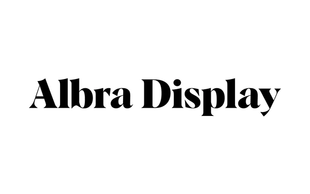
A high-contrast bracketed serif cut for headline use, with warm rounded curves and sharp serifs across six weights from Light to Black.
About
Albra Display is the large-scale cut of Jan Weidemüller's Albra optical-size family, released by Rellence in 2019. Its letterforms push contrast to the display extreme, pairing narrow bracketed serifs with open, rounded bowls that read well in fashion editorial, packaging and branding headlines. All six weights ship with matching italics, and variable font versions cover both upright and italic axes.
Classification
High-contrast bracketed serif with warm rounded curves and sharp serifs. Display-optimised cut of the Albra optical-size family (Text, Regular, Display, Book), tuned for large-scale headline settings. Features alternate 'a' and 'R' glyphs, old-style figures and ligatures. Variable font versions available for both upright and italic axes.