 MegaMegaTypeType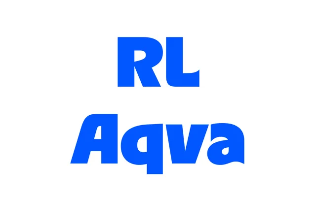
A cheerful display typeface from 2024 inspired by phototypesetting-era grotesques such as Revue and ITC Busorama, with asymmetric capitals and fluid, wave-like forms across four weights plus a variable font.
About
RL Aqva draws on the graphic confidence of 1960s and 70s phototypesetting with organic, simplified letterforms built for headlines and bold visual statements. Asymmetric constructions in characters like 'A' and 'Y' introduce a playful tension, countered by forward-reaching forms in 'R', 'S', 'D' and 'B'. The design allows characters to overlap intentionally, creating dense, cohesive text blocks suited to eye-catching display work.
Classification
Designed explicitly for display use with organic, simplified letterforms drawing on humanist phototypesetting-era typefaces such as Revue, Marvin and ITC Busorama. The asymmetric capital constructions and fluid, wave-like strokes place it firmly in the expressive display category.