Violeta
Quintana-Font · Javier Quintana Godoy
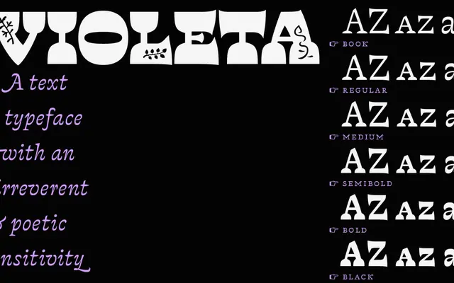
A reverse-contrast text serif in six weights with matching italics and an illuminated capital style, developed unhurriedly by Chilean designer Javier Quintana Godoy.
About
Violeta's defining feature is its pronounced reverse contrast, inverting the conventional weight distribution of text serifs so that horizontal strokes dominate over verticals. Despite this unconventional trait, the family is conceived for text setting and includes six weights from Book to Black, each with a roman and italic companion. A separate Jardinera style provides ornamental illuminated capitals, and the family is equipped with small caps, multiple figure styles, alternative glyphs and stylistic sets via OpenType.
Classification
Violeta employs a stark reverse contrast, where horizontal strokes are heavier than verticals, inverting the conventional stress of traditional serif letterforms. This places it firmly within the reverse-contrast or 'Tuscany-adjacent' serif tradition, though designed primarily for text use.