Simona
Quintana-Font · Javier Quintana Godoy
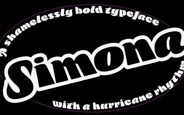
A single-weight display script that alternates cursive and reverse-cursive letterforms to create a 'hurricane rhythm' suited to large headlines and short bursts of text.
About
Simona is built around the idea of maximum blackness combined with rhythmic directional contrast, mixing forward and backward-leaning letters within one unified style. The result is a dense, energetic typeface intended exclusively for large sizes where its alternating cadence reads as deliberate rather than inconsistent. It comes in a single Bold weight, with no italic or condensed variants.
Classification
A bold display script that mixes cursive and reverse-cursive letterforms within a single style, creating an alternating rhythm intended for large-scale headline use. The deliberate mixing of forward and backward-leaning letters places it firmly in the display category.