 MegaMegaTypeType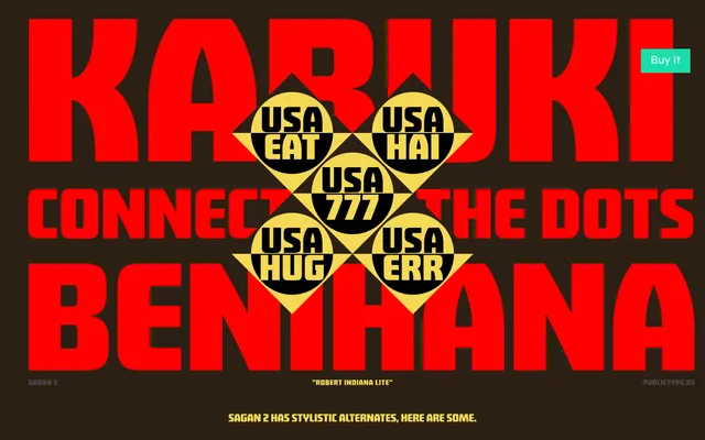
A nine-weight geometric display family originally drawn by Michael Cina in 2014, offering over 800 glyphs with four stylistic sets that shift the typeface from editorial restraint to graphic expressiveness.
About
Sagan 2 draws on early geometric type while adding a soft nostalgic quality, making it suited to identity systems, posters and editorial titles. Four stylistic sets provide significant variation across letters including alternate forms for O, Q, W and numerals, allowing the same family to read either clean or characterful. Full Latin and Cyrillic support, small capitals, oldstyle figures and a variable font version round out an unusually complete display offering.
Classification
Rooted in early geometric type traditions with a pronounced display orientation, Sagan 2 uses circular forms and clean construction while incorporating expressive stylistic alternates that push it well beyond neutral geometric territory.