Philomela
PSY/OPS Type Foundry · Lars Bergquist
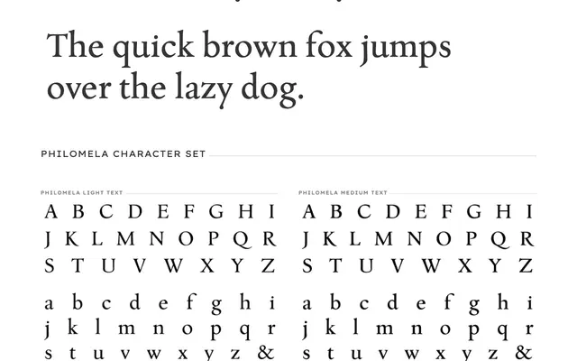
A Renaissance-style text family by Lars Bergquist, designed in three micro-weights to recover the optical density and readability qualities that letterpress type achieved through size-specific cutting.
About
Philomela works against the crisp sterility of most digital revivals by offering Light, Medium and Dark weights that allow fine control of ink density across different media and point sizes. Each micro-weight comes with Roman, Italic and Smallcaps; the family is completed by a separate Titling face and engraved Initials. True to its Renaissance sources, no bold weight is included, the interval between Light and Dark providing sufficient contrast for emphasis.
Classification
Venetian/Renaissance-style text face drawing on humanist serif traditions of the 15th and 16th centuries, designed with micro-weight variation to emulate the optical size adjustments of letterpress type-cutting.