Luminance
PSY/OPS Type Foundry · Stefan Hattenbach
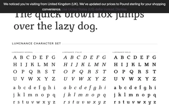
A modernised revival of Carl Pracht's 1941–43 calligraphic serif, reworked by Stefan Hattenbach to be cleaner and more contemporary while retaining traditional italic letterforms and old-style figures.
About
Stefan Hattenbach adapted Pracht's original design to reduce its calligraphic heaviness, producing a typeface that reads equally well at text and display sizes. The italic cuts use historically informed alternate letterforms for a, f, g, k, v, w and y, and the numerals are set as old-style figures. Western and Eastern European character sets are included, along with stylistic alternates, ligatures and a separate smallcaps font.
Classification
A calligraphic serif with humanist roots, modernised from Carl Pracht's 1941–43 original. The italic employs traditional letterforms (a, f, g, k, v, w, y) and old-style figures, placing it firmly in the humanist serif tradition.