Catacumba
PSY/OPS Type Foundry · Rui Abreu · 2009
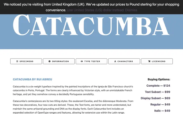
A six-weight decorative serif by Rui Abreu, drawn from painted inscriptions in the catacombs of Porto's Igreja de São Francisco church, blending Victorian and French Didone influences.
About
The family divides into two display titling cuts — the exuberant Excelsa and the Didone-influenced Moderata — and four text derivatives that share the same artisanal DNA while remaining more restrained. Each font ships with extended Western and Eastern European characters, smallcaps, stylistic alternates, ligatures and both proportional and old-style numerals. Produced and mastered by PSY/OPS between 2008 and 2009, it is a joint release with Fountain.
Classification
A decorative serif with Victorian and French Didone influences, featuring two distinct titling cuts (Excelsa and Moderata) and four text derivatives. The Didone-inflected high contrast and ornamental character place it firmly in the display category.