Aalborg
PSY/OPS Type Foundry · Lars Bergquist · 2001
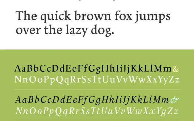
A three-cut Renaissance serif by Lars Bergquist, designed for text-display settings with unusually pronounced calligraphic detail and no bold weight by deliberate choice.
About
Bergquist pushes the calligraphic qualities of the pen-drawn letter as far as possible while keeping the face viable for continuous reading. The family comprises Roman, Italic and Smallcaps only; the absence of a bold weight is intentional, as one would have undermined the design's integrity. Classic oldstyle figures accompany the Roman and Italic, while the Smallcaps font uses ranging figures instead. Originally named Absolut Type, it received a Certificate of Excellence in a UNESCO-sponsored international type competition in 2001–02 before being renamed after the Danish city of Aalborg.
Classification
Firmly based on Renaissance letterform models with pronounced calligraphic detail, placing it squarely in the humanist serif tradition. The design prioritises pen-influenced stroke contrast and classical proportions suited to text-display settings.