 MegaMegaTypeType
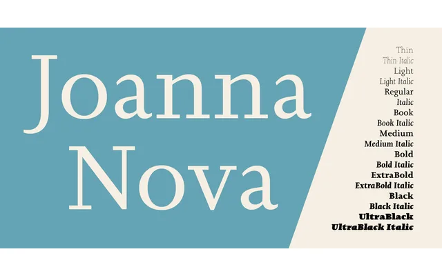
Ben Jones's 2015 expansion of Eric Gill's Joanna, redrawn from original sketches and copper patterns, extending the family to 18 fonts with new weights, Greek and Cyrillic support, and reworked italics.
About
Every glyph was redrawn using Gill's original sketches and the copper patterns from Joanna's initial production, with Jones explicitly reconciling the discrepancies between the hand-set metal type, the Essay on Typography version and the familiar digital release. The italics received particular attention, being widened to match the proportions of the original hand-set fonts after later digital versions had rendered them too condensed for small-size use. New weights from Thin to Ultra Black, small caps for all scripts in upright and italic styles, and several numeral options substantially broaden the family's typographic range.
Classification
Joanna Nova is a slab serif revival of Eric Gill's original Joanna, characterised by its extremely fine, almost hairline serifs and low stroke contrast — a defining feature of the Joanna design that sits between a traditional slab and a transitional serif.