 MegaMegaTypeType
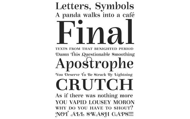
A high-contrast titling serif drawing on Bodoni and Didot conventions, tempered by chancery script and nineteenth-century advertising influences.
About
Released in 2005, Gilibert blends the sharp stroke contrast and hairline serifs of the Modern style with structural cues from chancery scripts and period advertising lettering. The result is a typeface suited to prominent, sparingly used settings rather than continuous text. Its distinctiveness makes it most effective as a headline or display face where its idiosyncratic forms can command attention.
Classification
High-contrast serif with Bodoni and Didot DNA, but its titling-only intent, chancery script influences and nineteenth-century advertising references push it firmly into the display category rather than text serif.