 MegaMegaTypeType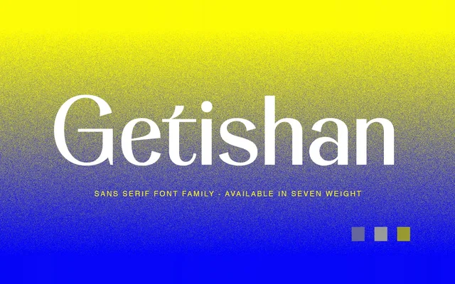
A seven-weight display serif family designed for headline and branding use, with stroke contrast that increases progressively from thin to extra bold.
About
Getishan spans seven weights from Thin to Extra Bold, with lighter cuts reducing contrast and optical correction to achieve a softer, warmer tone. Heavier weights gain more pronounced character, making the family adaptable across both delicate and assertive display contexts. PUA encoding ensures full glyph access without specialist software.
Classification
A display-oriented serif with increasing character contrast across its weight range. Stroke contrast and optical correction are deliberately reduced at lighter weights to produce a softer appearance, while heavier weights gain more pronounced character.
Weights
ThinExtra LightLightRegularMediumBoldExtra Bold
Languages
Latin
Tags
displayserifbrandingheadlinepackagingeditoriallogoPUA