 MegaMegaTypeType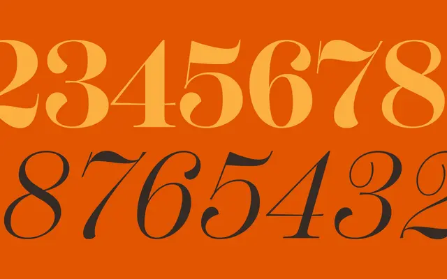
A high-contrast display serif by Neil Summerour, offered across three widths with six weights and matching calligraphic italics, designed as the display companion to Scotch Text.
About
Scotch Display is not a scaled-up version of its text sibling but a distinct cut with shorter ascenders and descenders, greater stroke contrast, and a more folded, calligraphic italic. It sits within the broader Scotch family alongside Scotch Text and Scotch Deck, each optimised for a specific size range whilst sharing a coherent visual DNA. Three widths – standard, Condensed and Compressed – extend the family's versatility across editorial, branding and headline use.
Classification
High-contrast display serif in the Scotch Modern tradition, featuring short ascenders and descenders, pronounced thick-thin stroke contrast, and a calligraphic italic distinct from the text companion. The design draws on 19th-century British and Scottish printing types.