 MegaMegaTypeType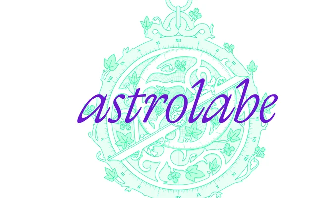
A fine, calligraphic serif with a flowing italic, named after the medieval star-measuring instrument.
About
Astrolabe is a light serif drawn with a broad pen in mind, and its italic does most of the talking: long, swinging strokes and open shapes that feel half written, half drawn. Four weights from Thin to Regular, each with an italic and a variable font, keep it on the delicate side. Good for book covers, editorial headlines and anything with a whiff of old astronomy.
Classification
A light, calligraphic serif whose italic leads the family: long, flowing entry and exit strokes, open bowls and pen-like contrast. Four weights from Thin to Regular, each with an italic, sit at the delicate end of the range for display and literary settings.
Weights
ThinExtraLightLightRegular
Family
Astrolabe Italic
Languages
Latin
Tags
calligraphicelegantliterarylightitaliceditorialdisplayvariablemystical