 MegaMegaTypeType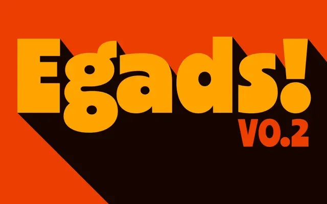
A hearty geometric sans that sits heavily on its baseline.
About
Egads has the low contrast and straight-cut terminals of the classic geo-sans, then piles its weight into the bottom of every letter. The effect is cheerful and loud, a display face that lives up to its name. Three weights so far, with a variable font planned.
Classification
Sold as an in-progress release on Future Fonts (v0.2). Geometric sans energy in the line of ITC Kabel, subverted by an exaggerated bottom-heavy weight. Medium, Bold and Heavy so far; variable fonts planned.
Weights
MediumBoldHeavy
Languages
LatinLatin Extended
Tags
geometricbottom-heavykabelheadlinesplayfulpostersdisplay