 MegaMegaTypeType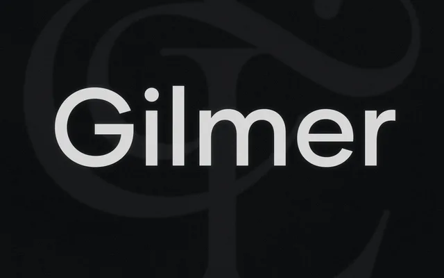
A six-weight geometric sans with even stroke contrast and broad Latin diacritic coverage, sold as a single upright family without italics.
About
Gilmer takes a straightforward geometric approach across six weights from Thin to Heavy, with circular letter forms and consistent stroke widths. The glyph set covers an extensive range of Latin diacritics for Central and Eastern European languages, alongside lining and tabular figures, fractions, stylistic alternates and case-sensitive forms. The absence of italics limits its suitability for sustained body text, positioning it more naturally in display and branding contexts.
Classification
A clean geometric sans-serif with even stroke weights and circular forms, typical of the geometric grotesque tradition. No italics or condensed variants are offered; the family spans six weights in a single upright width.