displaydisplay sans-serif
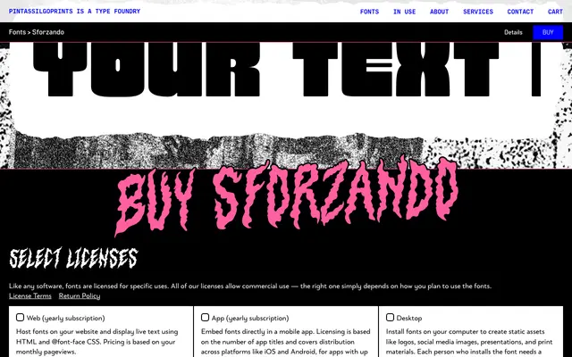
A bold display sans-serif in three weights with compact letterforms, tight spacing and a set of stylistic alternates aimed at poster, editorial and titling work.
About
Sforzando offers three weights – Regular, Alto and Altissimo – that progressively push the design towards heavy impact use. Compact proportions and tight spacing give the family a dense, punchy presence suited to concert posters, film titles, book covers and packaging. Discretionary ligatures and stylistic sets provide additional variation for designers seeking a more individual result.
Classification
A bold display sans-serif with compact letterforms and tight spacing, designed primarily for large-scale applications such as posters and titles rather than continuous text.
Weights
RegularAltoAltissimo
Languages
CatalanCroatianDanishDutchEnglishFilipinoFinnishFrenchFulaGermanHungarianIndonesianItalianMalayMalteseNorwegianPortugueseRomanianSlovenianSpanishSwedishTurkish
Tags
displaysans-serifboldpostereditorialcompactmoderntitling