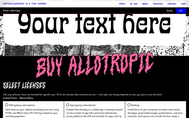
A two-weight decorative display face inspired by J.M. Bergling's 1914 alphabet and its 1960s Photo-Lettering reinterpretation, with pronounced Art Nouveau character.
About
Allotropic draws on a specific lineage: Bergling's 1914 untitled alphabet and its later Photo-Lettering interpretation, resulting in letterforms with the organic curves and ornate detail typical of Art Nouveau. Two weights, Regular and Bold, are supported by OpenType features including stylistic alternates and ornaments. The family suits book covers, packaging and branding where a vintage or period aesthetic is desired.
Classification
A decorative display face with strong Art Nouveau characteristics, drawing from a 1914 Bergling alphabet and its Photo-Lettering interpretation. The ornate, period-influenced letterforms place it firmly in the display category.