 MegaMegaTypeType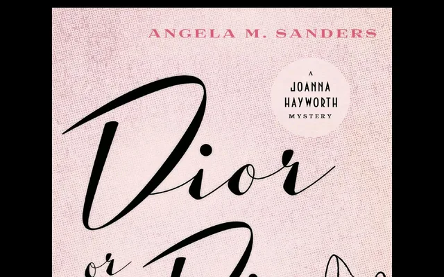
A reworked companion to Luxus Brut with tighter spacing and amplified stroke contrast, drawn from mid-20th-century signage lettering traditions.
About
Originally sketched as a bolder variant of Luxus Brut for a Viennese sixties-themed event, the project became a complete redrawing of all shapes in the spirit of mid-century signage lettering. The heightened thick-thin contrast distinguishes it clearly from its predecessor, while OpenType features include two Stylistic Sets offering alternate character forms, contextual ending substitutions and underlining swashes.
Classification
A high-contrast display face rooted in mid-20th-century signage lettering, with amplified thick-thin stroke contrast and distinctive letterforms drawn from that vernacular tradition.
Weights
Regular
Languages
Latin
Tags
displaysignagehigh-contrastvintagemid-centuryletteringdecorativeaustrian