 MegaMegaTypeType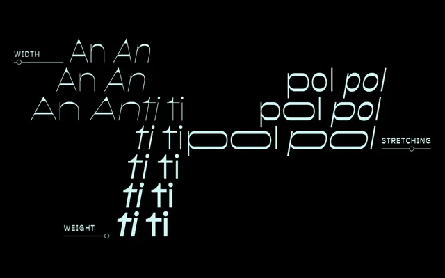
A reversed-stress display family by Roland Hörmann spanning three widths and five weights with matching italics, available as a variable font with extreme width-stretching capability.
About
Antipol flips conventional stroke contrast, weighting horizontals over verticals in the tradition of 19th-century American wood type and 1970s speculative design. The Hairline weight is the most distinctive, where ultra-thin diagonals terminate in arrowhead corners that read particularly well at large sizes. The variable version adds Wide and Extended cuts in Hairline, with a stretching axis that allows individual letterforms to be pushed to exceptional widths. The family includes old-style figures, tabular figures and small caps throughout.
Classification
Antipol deliberately inverts conventional stroke stress, making horizontal strokes heavier than verticals – a hallmark of 19th-century American wood type and 1970s sci-fi lettering. This places it firmly in the display category as a reversed-stress typeface with avantgarde characteristics.