Woodford Bourne PRO
Paulo Goode · Paulo Goode · 2016
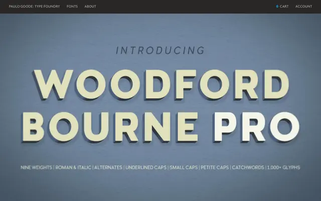
An expanded evolution of the original Woodford Bourne, drawn from stone-cast lettering on historic Cork City buildings, offering nine weights with italics, small caps, petite caps, underlined caps and over 1,000 glyphs.
About
Inspired by the letterforms cast in stone on former Woodford, Bourne & Co. buildings in Cork, Ireland, this expanded version adds 500+ glyphs over its predecessor alongside thorough redesign and rekerning of each character. Stylistic sets cover vintage alternates, petite caps, underlined caps, catchword sets and discretionary ligatures including a dedicated 'www' ligature. The designer positions it primarily as a display face for headlines and branding, with lighter weights suited to body copy.
Classification
Described explicitly as a Vintage Grotesque Sans Serif, inspired by stone-cast letterforms found on historic building façades in Cork City, Ireland. The design carries period character through stylistic alternates that reinforce its vintage grotesque identity.