Woodford Bourne
Paulo Goode · Paulo Goode · 2015
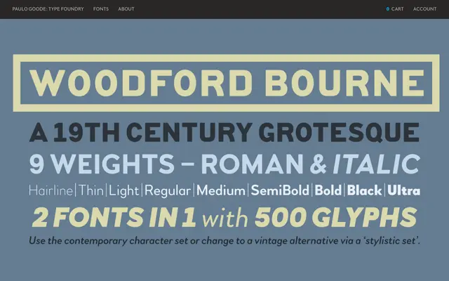
A grotesque revival drawn from stone-carved lettering on the former Woodford, Bourne & Co. buildings in Cork, available in nine weights with matching italics and a vintage stylistic set.
About
Inspired by distinctive stone-cast letters on 19th-century façades in Cork City, Ireland, the design carries subtle rounded corners to soften the industrial quality typical of grotesques. A Stylistic Set allows one-click switching between contemporary forms and a more vintage character set, giving designers two distinct voices from a single family across 18 fonts. The contemporary side acknowledges the influence of Gotham and Proxima Nova, while the vintage alternates preserve the original historical character.
Classification
A 19th-century grotesque revival with subtle rounded corners and dual contemporary/vintage stylistic modes, placing it firmly in the grotesque sans-serif tradition alongside Gotham and Proxima Nova.