Verbatim
Paulo Goode · Paulo Goode · 2018
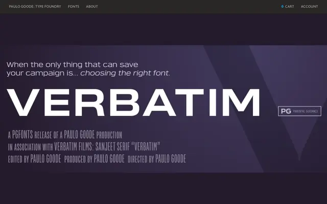
A 60-style geometric square sans inspired by 1970s science fiction cinema, built across five widths and six weights with matching obliques.
About
Verbatim takes its cues from the Microgramma and Eurostile tradition, blending squared forms with rounded details and a touch of humanistic stroke contrast. Five width variants from Condensed to Extended, paired with six weights, give the family considerable range for titling, logo and branding work. A large x-height and open counters lend it more legibility than its cinematic influences might suggest.
Classification
Square sans-serif with geometric construction and humanistic stroke contrast, mixing rounded and square forms in the tradition of Microgramma and Eurostile. The squarish, large x-height design places it firmly in the geometric sans category with a display-oriented character.