Torus
Paulo Goode · Paulo Goode · 2017
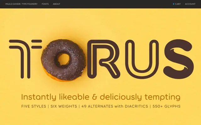
A rounded geometric sans in five stylistic variants – monoline, biline, outline, inline and notched – designed primarily for logo and headline use, with 49 alternate glyphs to aid wordmark construction.
About
Originally drawn for Paulo Goode's own studio logotype around 2011, Torus was completed as a full typeface in 2017 and expanded in 2018 with four additional styles. Six weights run across all five style variants, totalling 30 fonts, each sharing the same soft terminals and circular construction. The extensive alternate glyph set of 49 characters is aimed squarely at graphic designers building wordmarks and brand identities.
Classification
A rounded geometric sans with strict monoline construction and soft terminals, available in five stylistic variants including outline and inline treatments. Its circular, low-contrast forms place it firmly in the geometric sans tradition with a rounded subcategory.