Sqwared
Paulo Goode · Paulo Goode · 2020
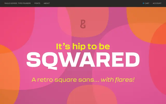
A square sans with subtle vertical flaring drawn from late-sixties and early-seventies signwriting, available in eight weights with matching italics and variable font support.
About
Sqwared takes the geometry of a square sans and introduces slight flares on the verticals, echoing the stroke of a signwriter's brush. Large open counters, a generous x-height and wide proportions keep the letterforms legible even at smaller sizes, while the retro character lends itself to headlines, logos and branding. The family spans 16 fonts across eight weights from Thin to Ultra, each with a roman and italic, plus variable font files for fine-grained weight control.
Classification
A square sans serif with subtle flaring on verticals inspired by signwriter brush strokes, giving it a hybrid quality between geometric sans and a lightly serifed display face. The retro character and wide proportions place it firmly in the display sans tradition.