Slabber
Paulo Goode · Paulo Goode · 2020
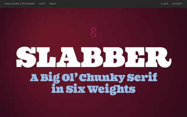
A six-weight display slab serif drawing on 19th-century wood type, with heavy bracketed serifs and a deliberately oversized x-height that creates awkward, stylish tension.
About
Built for headlines, logotypes and packaging, Slabber's Clarendon-derived serifs are heavy and bracketed, rooted in wood type tradition. The unusually large x-height set against a compressed cap height gives the face an off-kilter energy that distinguishes it from more conventional display slabs. Twenty-two alternates extend its expressive range across six weights, covering all Latin European languages.
Classification
Heavy bracketed serifs with a strong 19th-century wood type influence place this firmly in the Clarendon tradition. Designed exclusively for display use, with a very large x-height and small cap height creating deliberate proportional tension.