Pseudonym
Paulo Goode · Paulo Goode · 2016
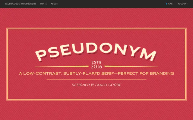
A low-contrast incised serif in four weights across narrow, regular and wide widths, designed for branding and logo work with influence from Albertus and Friz Quadrata.
About
Pseudonym blends the flared, incised serifs of faces like Albertus and Friz Quadrata with the clean solidity of contemporary sans-serifs, aiming for presence and legibility at display sizes. The family spans 24 fonts across three widths and four weights, each available in roman and italic. OpenType features include true small caps with matching diacritics and figures, discretionary ligatures, catchwords and alternate characters for common contractions such as limited, number and incorporated.
Classification
A low-contrast serif with subtly flared terminals drawing on the incised tradition of Albertus and Friz Quadrata, combined with the proportional solidity of contemporary geometric and humanist sans-serifs.