PG Grotesque
Paulo Goode · Paulo Goode · 2023
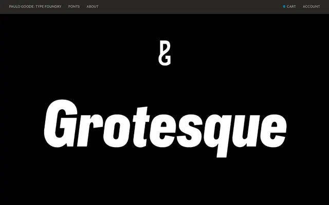
A 99-font reinterpretation of the obscure German grotesque Edel Grotesk (c.1914), spanning nine weights and six widths with a companion variable font.
About
Discovered in the opening titles of two early-1970s Italian films, Edel Grotesk had almost no surviving reference material; Paulo Goode used its essence rather than attempting a strict revival. Distinctive details include high-waisted capitals, a straight-legged R and flattened arches on the a and g, lending the family a period character suited to display and branding work. The full family of 99 OTFs is complemented by a single variable font covering weight, width and italic angle, plus small caps and broad European Latin language support.
Classification
A grotesque sans-serif drawing on the early twentieth-century German tradition, specifically Edel Grotesk (c.1914, Johannes Wagner GmbH). High-waisted capitals, a straight-legged R and flattened arches in the a and g place it firmly in the pre-war European grotesque lineage.