Logik
Paulo Goode · Paulo Goode · 2020
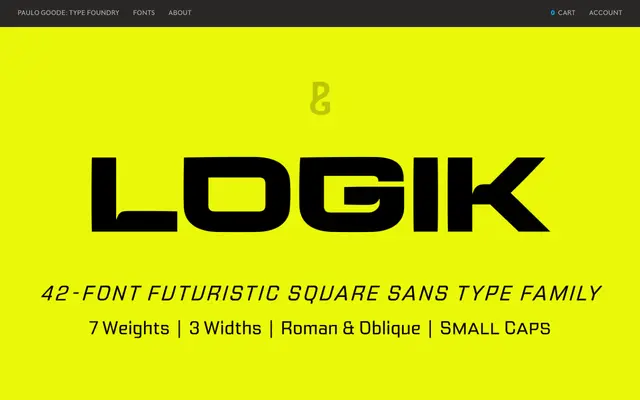
A square sans released in 2020 with sharp cornered terminals across seven weights and three widths, designed for display, branding and headline use.
About
Logik follows the Microgramma and Bank Gothic tradition of squared-off terminals, with incised ink traps and slightly tapered strokes adding character beyond simple geometric construction. Seven weights from Thin to Black are available in Regular, Wide and Extended widths, each with a matching oblique, totalling 42 fonts. Each font includes small caps, old style figures and full European Latin language support.
Classification
A geometric square sans with sharply cornered terminals rather than rounded ones, placing it in the tradition of Microgramma and Bank Gothic. Its stylised ink traps and slightly tapered strokes give it a distinctive display character beyond standard geometric sans classification.