Hierophant
Paulo Goode · Paulo Goode · 2022
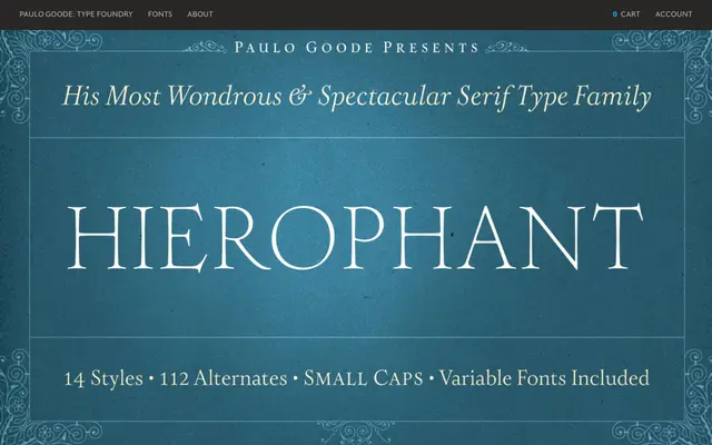
A 14-font humanist serif with calligraphic roots in Cresci's 16th-century work, offering high contrast, diagonal stress and pinched stems across seven weights with roman and italic cuts.
About
Hierophant bridges Old Style and Transitional traditions with a distinctly hand-drawn quality derived from the calligraphic influence of Giovanni Francesco Cresci. Its high contrast, diagonal stress and pinched stems lend it a characterful texture suited to both text and display settings. OpenType features include ornate teardrop serif alternates, swash variants, small caps and old-style figures, backed by a 1,000+ glyph set covering all Latin European languages.
Classification
Old Style and Transitional heritage with diagonal stress and high contrast, drawing heavily on 16th-century calligraphic influence from Giovanni Francesco Cresci. The pinched stems and hand-drawn quality place it firmly in the humanist serif tradition.