Harmonique
Paulo Goode · Paulo Goode · 2021
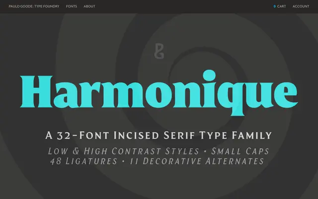
A 32-font incised serif family in two optical styles — Text and Display — spanning eight weights with matching italics, released in 2021 and distributed via Monotype.
About
The Text style draws on the even stroke contrast of humanist sans serifs, with subtly flared terminals that recall signwriting craft. The Display style shifts towards a more calligraphic structure, with aggressively barbed serifs and chiselled counter arcs that give headlines and identity work a flamboyant edge. Practical OpenType features include 48 ligatures for all-cap titling, alternate capitals across four stylistic sets, small caps with matching diacritics, and optional proportional lining figures alongside the default old-style numerals.
Classification
An incised serif with low-contrast humanist forms and subtly flared terminals in the Text style, alongside a higher-contrast calligraphic Display style with aggressively barbed serifs — placing it firmly in the incised/lapidary serif tradition.