Fnord
Paulo Goode · Paulo Goode · 2016
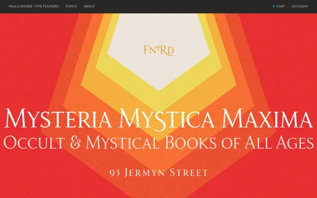
A 23-font humanist serif family whose proportions and stress axes were deliberately shaped by the numerological themes of Robert Anton Wilson's Illuminatus! Trilogy.
About
Designed around axes of 23° and 17° drawn from the fiction of Wilson and Shea, Fnord spans five weights in roman, italic, condensed and extended cuts, plus three decorative display styles: engraved, inline and woodcut. Each of the 23 fonts contains 680 glyphs, with small caps, 44 ligatures and 10 OpenType alternates. The foundry positions it primarily for branding work, where its distinctive slanted stress and characterful details can be put to best use.
Classification
Classified by the foundry as a humanist serif, with stress axes and proportions drawn on deliberate angles (23° for uppercase 'O', 17° for lowercase) giving it an unconventional but readable humanist character. Display variants including engraved, inline and woodcut extend the family beyond text use.