Fluid
Paulo Goode · Paulo Goode · 2018
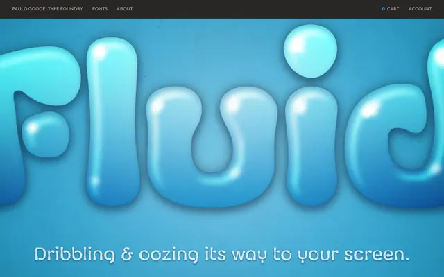
A six-weight display family drawn with a pipette, producing letterforms that mimic the dribble and flow of liquids at varying consistencies.
About
Created by physically drawing each letterform with a pipette using liquids of different viscosities, the results were then scanned and digitised. The family spans six weights from Thin to Black, with over 115 alternates and broad European Latin support, giving it more versatility than its novelty origins might suggest. Designed for headlines, logos and contexts that call for something sticky or fluid in character.
Classification
Drawn with a pipette using liquids of varying viscosity, Fluid sits firmly in the display category as a novelty freeform sans. Its organic, dribbled letterforms preclude standard text usage but maintain enough legibility for headline and logo applications.