Faded Grandeur
Paulo Goode · Paulo Goode · 2015
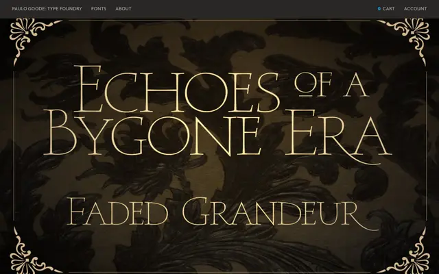
An all-caps display serif family of four weights, drawn from stone-engraved letterforms worn by time, intended for book covers, film titles and wedding stationery.
About
Originally conceived alongside Carrig in 1998 and redrawn for release in 2015, the family draws on the decayed grandeur of aristocratic stately homes and weathered stone engravings. Four weights from Thin to Bold are supported by 54 alternates offering a more idiosyncratic character than the standard set, along with small caps and Central European Latin coverage across 350 glyphs. The typeface is no longer commercially available.
Classification
An all-caps display serif inspired by stone engravings, classified by the foundry as a Trajan serif. The worn, decayed aesthetic and monumental letterforms align with inscriptional Roman traditions as interpreted through the Trajan model.