Eurocine
Paulo Goode · Paulo Goode · 2018
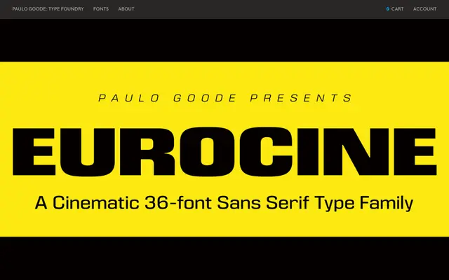
A 36-style square sans inspired by the credit typography of 1970s Italian Giallo films, sitting stylistically between Eurostile and Folio with extended proportions and high contrast.
About
Eurocine draws from an unidentified font spotted in Giallo film credits, borrowing its awkward weight, high contrast and characteristically wide 'M' and 'N' glyphs. The family spans six weights across three widths – Narrow, Regular and Wide – each available in Roman and Oblique, totalling 36 fonts. Small caps, petite caps, extended caps and unicase variants extend its typographic range considerably beyond a typical display face.
Classification
A square sans-serif display typeface with high contrast and extended proportions, influenced by Eurostile and Folio. Its distinctive geometry and stylistic variants place it firmly in the display category rather than functional text use.