Didonesque
Paulo Goode · Paulo Goode · 2017
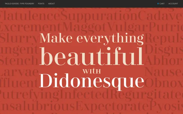
A 16-font Didone display family with small caps, petite caps and a higher x-height than classical models, aimed squarely at luxury branding and headline work.
About
Didonesque draws on the high-contrast Didot and Bodoni tradition but departs from strict historical precedent with a raised x-height, shortened ascenders and descenders, and subtle curvatures in the /v/w/y/ characters. The family spans Display, Roman, Medium, Bold, Black and Poster weights with matching italics, plus a four-weight Condensed range. Small caps and petite caps allow unicase-style typographic combinations, and over 30 ligatures and 11 alternates expand its expressive range.
Classification
A high-contrast Didone display serif with the characteristic hairline strokes and vertical stress of the classical Didot and Bodoni tradition. The elevated x-height, shorter extenders and slightly curved terminals in /v/w/y/ distinguish it from strict historical revivals.