Carrig Pro
Paulo Goode · Paulo Goode · 2017
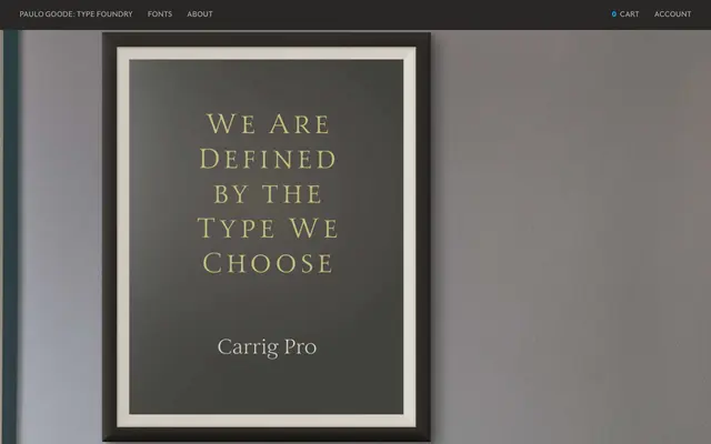
A 12-font Antiqua serif with roots in Roman inscriptions and Pre-Modern type, offering five weights with matching italics, small caps, discretionary ligatures and ornamental glyphs.
About
Released in 2017 as an expanded redrawing of the 2015 Carrig, this family spans Display and text sizes across five weights from Light to Black, each with a Roman and Italic. Typographic niceties include small caps, 53 ligatures, 15 stylistic alternates and a range of ornamental glyphs, giving it considerable depth for editorial and prestige work. The family was selected as one of Fontspring's Best of 2017 and is distributed via MyFonts and the Monotype Library.
Classification
Classified by the designer as an Antiqua, Carrig Pro draws from early Roman inscriptions and Pre-Modern type traditions, placing it in the broad humanist-to-old-style serif continuum with a distinctive hybrid character.